

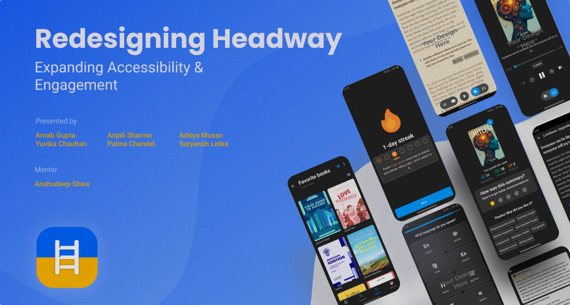
Redesigning Headway
Expanding accessibility and engagement on a book-summary app — for users who read in Hindi, get distracted, and want their reading to belong to them.
- Year
- 2025
- Discipline
- UX · UI
- Platform
- Android
- Scope
- 50+ screens · 2 weeks
THE WHY
Why redesign it
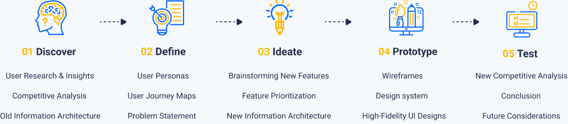
PROCESS
Discover → Define → Ideate → Design → Test
DISCOVER
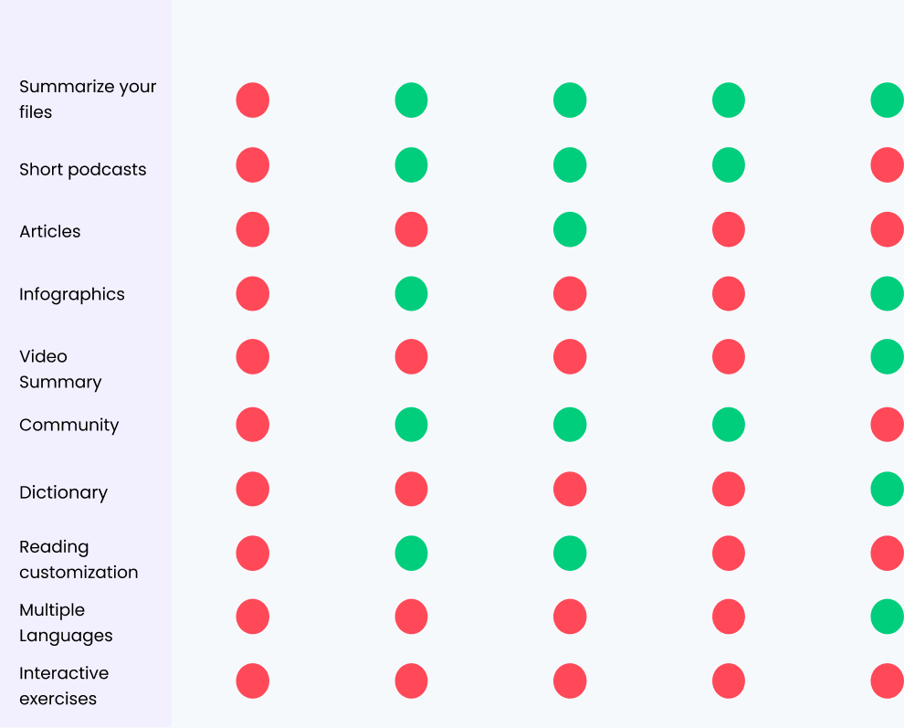
Competitor Analysis
DEFINE
What we set out to fix
01
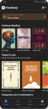
Complicated navigation
Users get lost between sections; features hide behind extra taps.
02
Lengthy onboarding
Too many intro cards. Users fatigue before seeing value.
03
Interruptive streaks
Mid-read prompts break flow and ask for attention at the wrong moment.
04
Restricted discovery
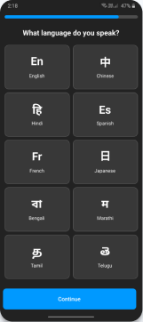
Search and recommendations feel narrow; no language variety.
05
No customization
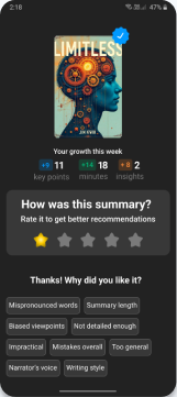
One reading mode, one font, no notes. Reading is forced to fit the app.
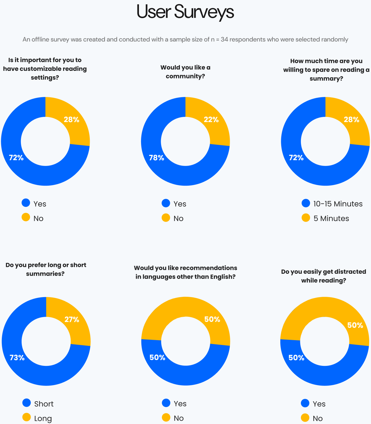
User Journey Map
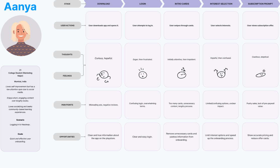
User Persona

IDEATE
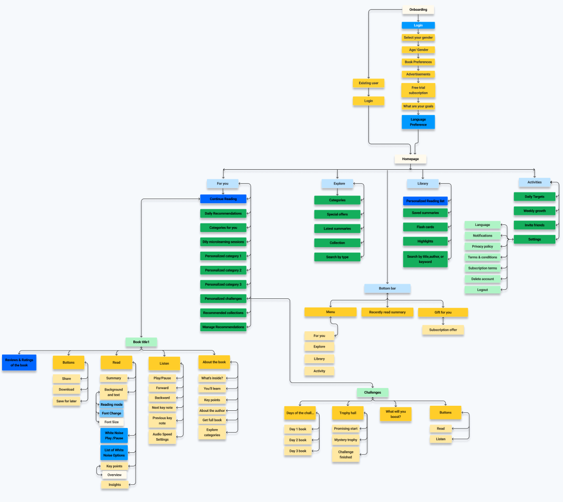
Restructured around how readers move
PROTOTYPE
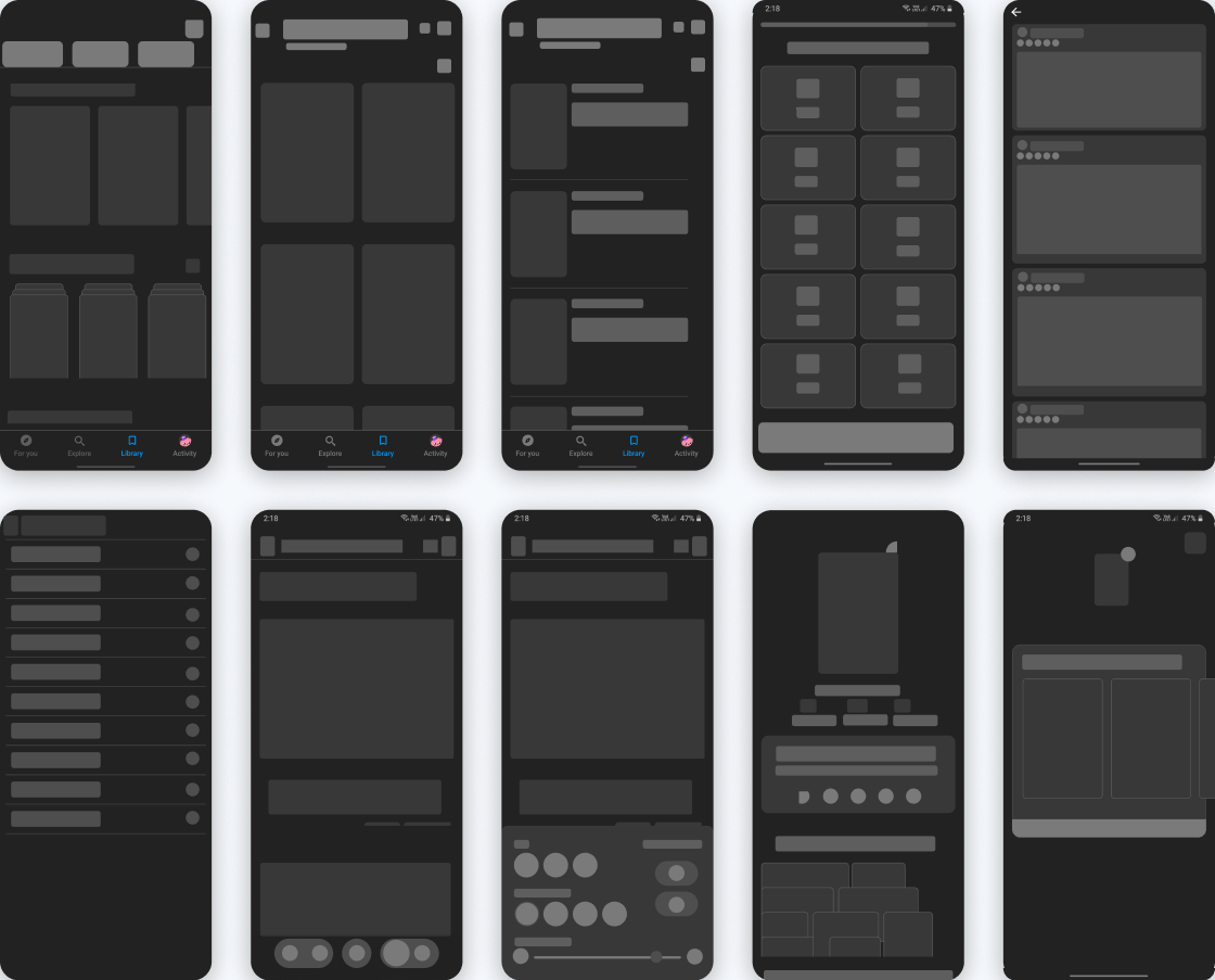
Wireframes
THE SCREENS
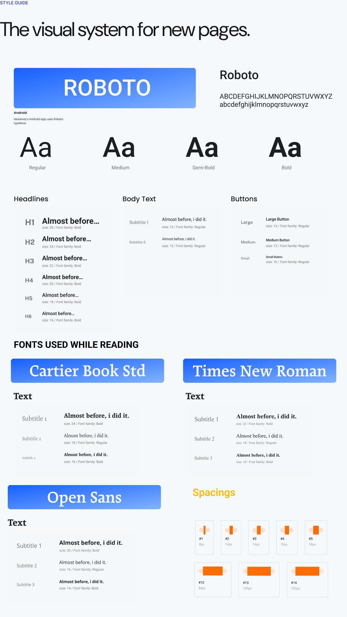
High-Fidelity UI Designs


REFLECTION
Key Takeaways
The most impactful design decisions came from what was removed, not added. Simplifying onboarding, reducing interruptions, and eliminating unnecessary choices showed that clarity and restraint often create a better experience than adding more features.